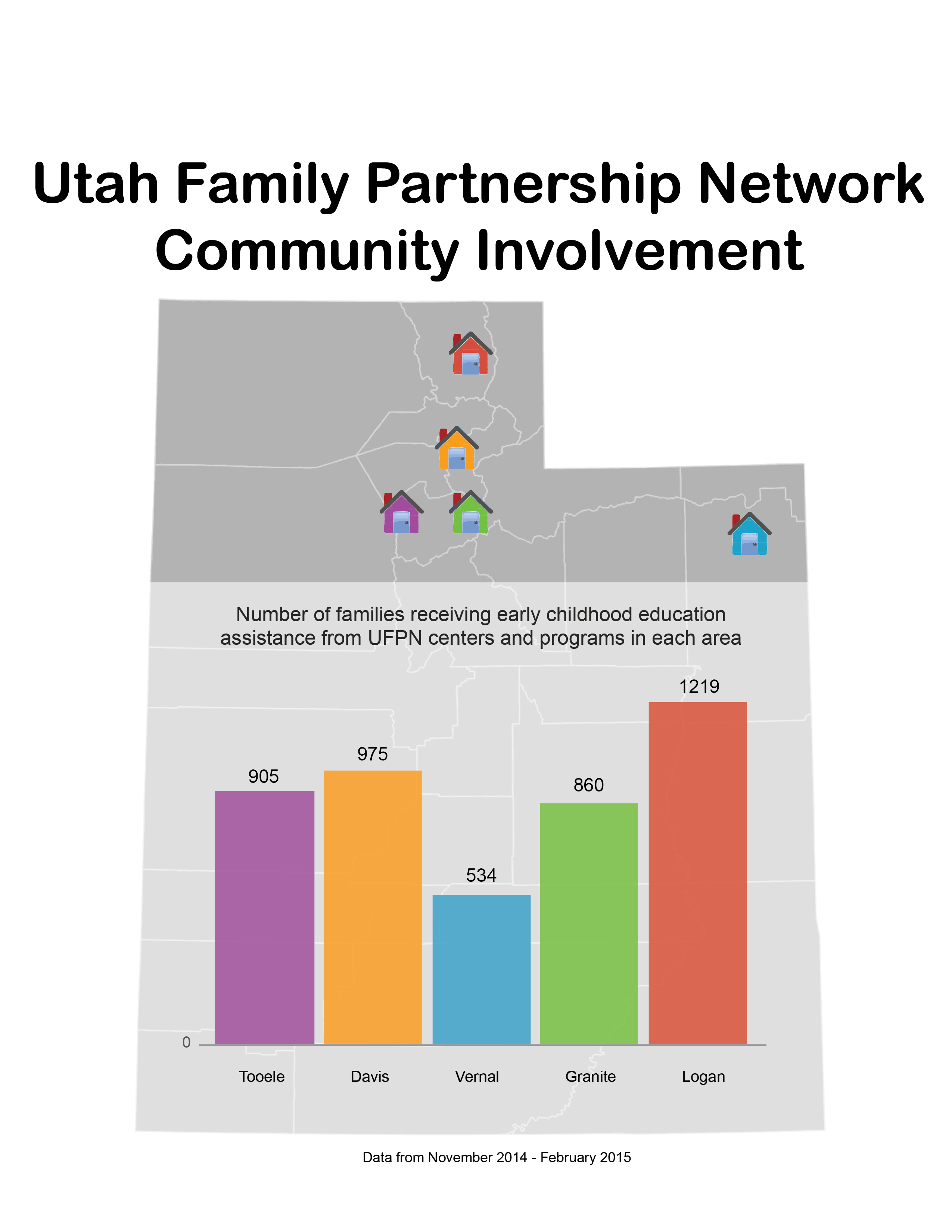
The Need - The non-profit Utah Family Partnership Network (UFPN) needed some way to display data for each of their five centers for two audiences. The first audience was the families they wanted to help, to show them that they weren't the only ones using these services. The second was potential donors and grant committees, who needed to see that the centers themselves were being used.
The Solution - I created this graphic using Adobe Illustrator and Apple Numbers primarily, with some work in Adobe Photoshop to clean up the artwork prior to assembling the final product. The visual design was intended to be colorful and interesting enough to catch the attention of a parent who might benefit from the programs offered by a UFPN center, but clear and professional enough to support the UFPN's fundraising. I worked with another writer to interpret a mountain of data collected by the UFPN and find the data points that best communicated the successes they were seeing at their centers.
The Outcome - This graphic was created in 2015, and there isn't any year over year data to compare since that time. But I think it shows pretty clearly my dedication to simplifying complex information in order to make it easy to understand.